The S&P500 P/E ratio says "overvalued". Time to short it?
It might be tempting to try to time the market. Even Michael Burry of "The Big Short" is doing it. But let's dig a little deeper and see what the data says.
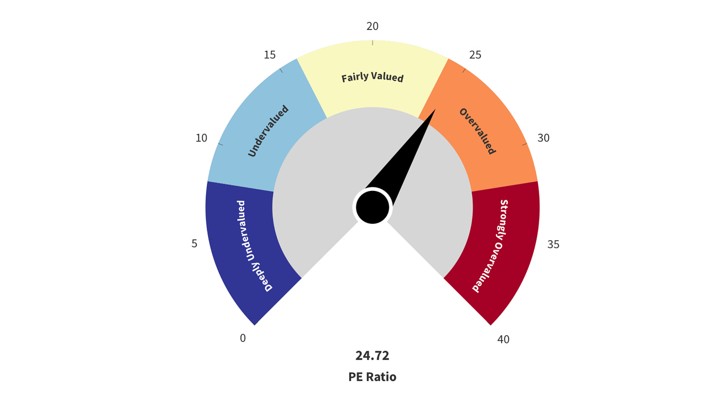
Despite the current uncertainty in the markets and the -5% drop in the S&P500, you might be surprised to learn that the price to earnings ratio of the index is actually in the “overvalued” territory.
Take this graph from Finasko:
What makes it “overvalued”? According to Finasko, it’s simply the fact that the current value is above the historical average.
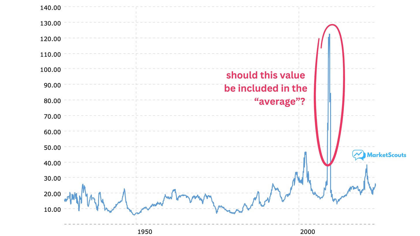
Okay, but that average has some pretty wild data in there – especially that one time in 2009 when the S&P P/E ratio almost hit 124!
These sort of extreme values can make an average meaningless.
Think about it this way: if Warren Buffett moved in the house next door, your neighborhood’s average wealth would probably go up a few hundred millions at least.
Would you personally be any richer, though?
But even if we exclude that extreme value, it’s obvious that the current P/E ratio is still a bit high, and also back on trending upwards.
Why are investors so obsessed about the P/E ratio?
The price to earnings ratio (P/E) is the most basic indicator investors use to figure out if a company is worth investing in.
But despite being so basic, experienced investors rely on it too.
Think about it this way: if a company doesn’t make a profit, is it even a “real business” yet? Anyone can spend $2 to make $1. And if a company does know how to be profitable, why should you pay more for it than for a competitor doing something similar?
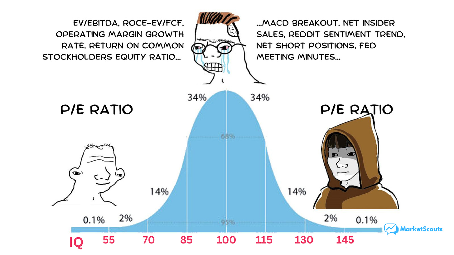
This meme says it all:
But the importance of the P/E ratio is not just a meme.
Plenty of researchers have looked at the predictive power of the P/E ratio, trying to figure out what we should expect when it’s high or low.
Take this chart shared by professional investor (and occasional blogger) Mark Ungewitter (ignore the 2021 date):
Basically, the higher the P/E, the less we should expect in terms of return. At the current 24ish level, we should expect to get anywhere between 0% to 4% over the next 10 years, if we buy the index now.
That’s lower than the 9.66% that the S&P has returned on average, every year, for the past 20 years.
But that’s a bit too simple.
The problem with timing the market using the P/E ratio
There are a few issues with trying to time the market using the P/E ratio.
First, those prices and earnings need to be adjusted for inflation: a dollar today isn’t the same as one last quarter, let alone a few decades ago.
There is a version of the P/E ratio that does this, and it’s called the Shiller P/E ratio or the CAPE ratio (cyclically adjusted price to earnings). It compares stock prices against their average earnings over a trailing 10-year time frame, adjusted for inflation.
According to Finasko, it says “overvalued” too. But let’s see how the actual correlation looks like:
Note two things:
that number “R squared” which is 0.40 something. That 0.4 means that about 40% of the returns can be explained by the “Shiller P/E” factor. So not even half of it.
there’s also a huge amount of variance between different years. For example, based on this chart and the correlation formula, if we buy the index now, we should expect to make either 0% or 5% over the next decade. An even bigger spread than what we saw in the previous, simple P/E chart.
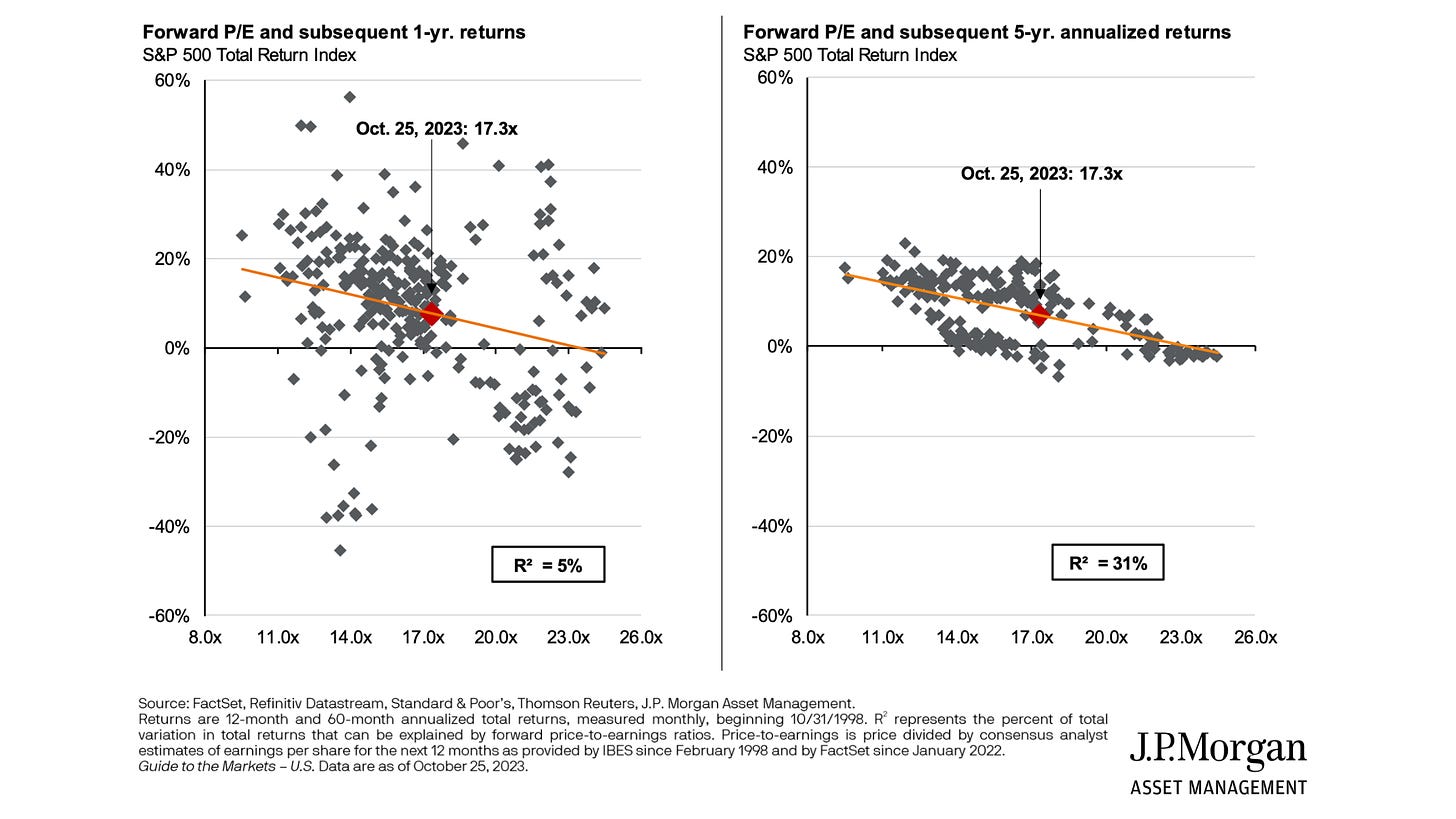
Or take this chart from JP Morgan Asset Management. It looks at the “forward P/E”. Instead of current earnings it uses projected earnings – how much companies expect to make in profit over the next quarter:
What it says:
the lower the forward P/E, the lower the expected returns. That’s the orange line. Same idea as before.
if we buy the S&P500 now, we should expect about 6-7% returns over the next years, on average. That’s more optimistic than what we saw before – and indeed on Finasko S&P 500 is labeled as “fairly valued” based on the forward P/E ratio.
but that average hides some really big variations: you could see a return of either -4% or +18% over the next five years, with a big gap in the middle!
Oh, and it also mentions that only about 31% of the expected return comes can be explained by the forward P/E ratio.
The numbers are even less clear in the short term, and the R squared there is only 5%.
So what should we do now?
First, keep in mind that low R squared value. Basically, even if correlation looks strong on the chart, it isn’t that strong in reality.
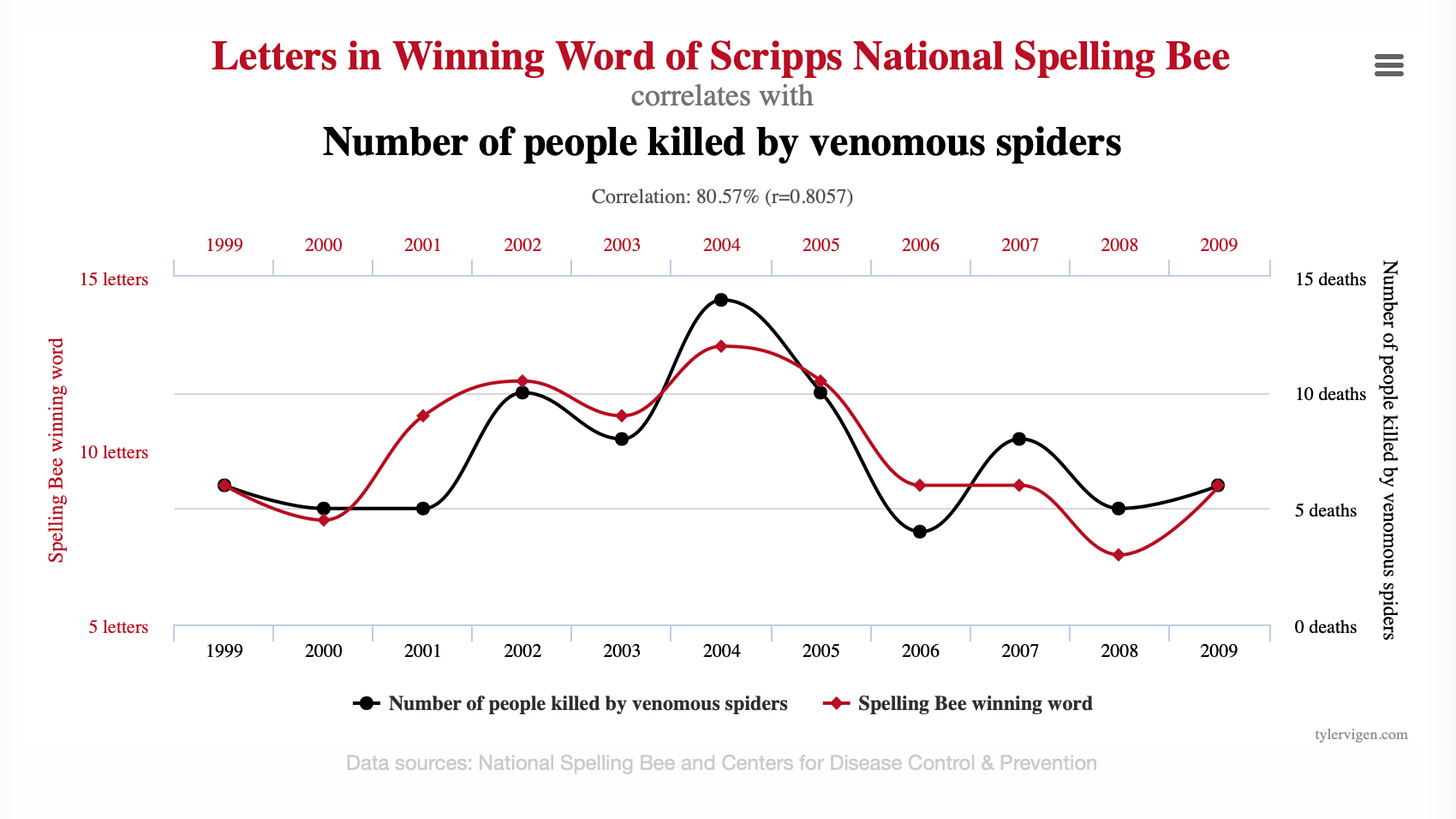
Just have a look at this chart:
You can see even more fun “correlations” on Tyler Vigen’s page by the way.
What you need to take from it is that sometimes things can seem correlated on a chart but they don’t actually have that much in common.
Right now markets are choppy. They might become even choppier. But the P/E ratio for the S&P 500 index, at least right now, doesn’t tell us as much as we think.
Second, focus on picking and investing in companies that are in great financial health, have significant earnings growth potential (and a history of delivering it), and trade at a good price. Maybe even look at bonds: interest rates staying higher for longer could mean you have an opportunity to lock in a 5-6% yield with less risk than investing in stocks.
And finally, when it comes to indicators that claim to tell you if the market is overvalued or undervalued, remember one thing:
Correlation is not causation.


